nga i just unlocked challenges and i randomly pressed challenge 6 and now i gotta restart over again what the f̷̢̨̡̧̱̱͚̦͙̥̰͇͕̬̩̖̳̘̙̩̰̘͕͖̘̹̦̰̩͍͖̙̺̲̯͙͎̹̠͇̤̻̠͈͔̫̹͓̯͉̓́̔̎̔̇̑̔͘ū̷̧̨̞̝̻̘͙͔̹̼̞̦̤̝̹̜͈͇̥̙̦̱͇͙̪͙̻̗͖̳̮̖̿̆̈̑͛͜͝ͅc̴̨̛̺͉͕̮̖̰̟͈̜̝̪̫̫͈̲͇̙̺͉̙͓̋̄͒̋̃́́̃͊̒̎̑̄̓̕k̸̛̳͓̲̊̍̀̔̍͌̍̋̈́̽̾͊̑̿̒͒̍̈͗̒͆͑̈̇͋̆͊̐͘̕̚̚͠͝ did you do bro
I'm pretty sure Dark Dust (#1c galaxy) doesn't work. My dust keeps getting up to e125 on each reset despite Dark Dust multiplier going from 2x to 6.7e9x
something with the sounds menu is broken because it will randomly re-enable music and SFX volume at random levels seemingly randomly. Otherwise pretty solid game!
I think I see what the problem is. It seems that the volume box is always clickable even when not visible so I have been clicking on icons on the screen and accidentally re-enabling the audio myself! Possible suggestion, instead of just moving the audio box to the background when it's not in use, either make it totally unclickable, or if not possible move it somewhere totally off screen?
percentage is measured differently when it comes to scientific notation. It's a strange concept, but this is what it is. Im not sure if it's the case here, but it can be
it like likely logarithmic (base 10). log(base10) of 1e4 is 4. log10 of 1e5 is 5. 4 is 80% of 5 because 4/5 = 0.8
the 1e4 is an abbreviated form of scientific notation, the long form being 1x10^4.
The reason you are seeing 85% is likely because 1e4 does not show enough decimal places and is likely something like 1.49e4 which would be about .85 of 1e5.
Dust gain 2 upgrade actually has an effect of x1.5 per level instead of x1.25 in the tooltip. I think the current balance is fine and tooltip should be fixed
The items show cost and amount when they're already maxed. You may want to consider using "MAX" instead of 1/1 and displaying "Bought" instead of the price once something has been bought. Though you may want to leave the actual max amount in for elements that have more than 1 upgrade stage.
Other than that, great progression! It's much more fun when you don't have to wait for hours. Although filling the first two stars might be a bit too slow for my taste, since you're only waiting for it to fill without any way to speed that up substantially.
I'm enjoying this game but I've hit an issue which isn't a problem with the game itself but possibly the itch UI? I don't seem to have a "full screen" button so the option to switch between the main screen and the star screen sits underneath the Itch top right links. Anyone know how I can hide these or force a full screen please?
if you have the ublock origin extension you can right click on the lettering of the links and click the block element option and press okay on the ublock popup which will shorten the links enough that they aren't in the way.
Don't waste time thinking you need to max out the challenges to get to the current endgame. I got to the end with challenge 1 & 2 at like 17 and 22. I did max challenge 3 though.
game basically feels done by the time you hit Supernova 25? if there's more I think it should be signposted? unlocking challenges feels like a "game over" in all but name.
83 isn't a wall, and in fact is quite close to where you should be rampaging through supernovas. You're missing an upgrade somewhere, or some new upgrade has released since.
Comments
Log in with itch.io to leave a comment.
nga i just unlocked challenges and i randomly pressed challenge 6 and now i gotta restart over again what the f̷̢̨̡̧̱̱͚̦͙̥̰͇͕̬̩̖̳̘̙̩̰̘͕͖̘̹̦̰̩͍͖̙̺̲̯͙͎̹̠͇̤̻̠͈͔̫̹͓̯͉̓́̔̎̔̇̑̔͘ū̷̧̨̞̝̻̘͙͔̹̼̞̦̤̝̹̜͈͇̥̙̦̱͇͙̪͙̻̗͖̳̮̖̿̆̈̑͛͜͝ͅc̴̨̛̺͉͕̮̖̰̟͈̜̝̪̫̫͈̲͇̙̺͉̙͓̋̄͒̋̃́́̃͊̒̎̑̄̓̕k̸̛̳͓̲̊̍̀̔̍͌̍̋̈́̽̾͊̑̿̒͒̍̈͗̒͆͑̈̇͋̆͊̐͘̕̚̚͠͝ did you do bro
The volume CONSTANTLY turns itself up. I had to repeatedly turn it back down over and over. I dont even understand how this could be a bug.
there is one issue i noticed, i can adjust the settings even when i have the settings menu closed
bug when the star is not there the nonexistent buten stil dose the ui
What's the formula of stardust gain and dark energy gain?
I'm pretty sure Dark Dust (#1c galaxy) doesn't work. My dust keeps getting up to e125 on each reset despite Dark Dust multiplier going from 2x to 6.7e9x
Besides that, great update!
Yeah, I've noticed that too
Wonderfully balanced! Update is overall 10/10.
i dont think so..?
something with the sounds menu is broken because it will randomly re-enable music and SFX volume at random levels seemingly randomly. Otherwise pretty solid game!
I think I see what the problem is. It seems that the volume box is always clickable even when not visible so I have been clicking on icons on the screen and accidentally re-enabling the audio myself! Possible suggestion, instead of just moving the audio box to the background when it's not in use, either make it totally unclickable, or if not possible move it somewhere totally off screen?
There needs to be a reset for dark energy as i picked the wrong perk bc on mobile you press you buy
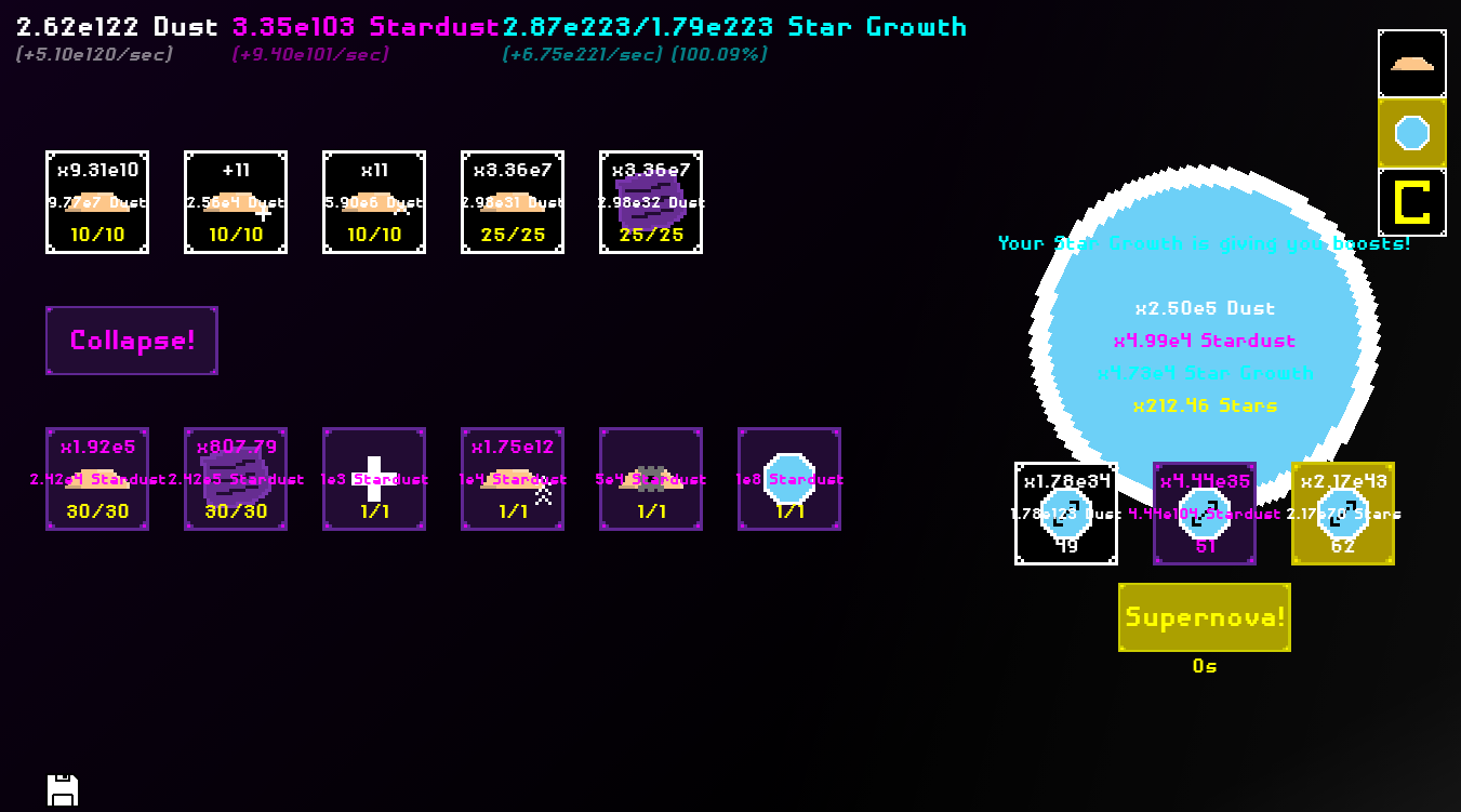
the percentages in this game are really weird. I don't get how 1e4/5e4 is 85% complete
percentage is measured differently when it comes to scientific notation. It's a strange concept, but this is what it is. Im not sure if it's the case here, but it can be
it like likely logarithmic (base 10). log(base10) of 1e4 is 4. log10 of 1e5 is 5.
4 is 80% of 5 because 4/5 = 0.8
the 1e4 is an abbreviated form of scientific notation, the long form being 1x10^4.
The reason you are seeing 85% is likely because 1e4 does not show enough decimal places and is likely something like 1.49e4 which would be about .85 of 1e5.
it is since when was 250 1 fifth of 1t
Dust gain 2 upgrade actually has an effect of x1.5 per level instead of x1.25 in the tooltip. I think the current balance is fine and tooltip should be fixed
Just unlocked challenges. Having a lot of fun with it so far. Would love to see this uploaded to galaxy.click
Second this one. Would be a great addition to Galaxy!
it is now
The items show cost and amount when they're already maxed. You may want to consider using "MAX" instead of 1/1 and displaying "Bought" instead of the price once something has been bought. Though you may want to leave the actual max amount in for elements that have more than 1 upgrade stage.
Other than that, great progression! It's much more fun when you don't have to wait for hours. Although filling the first two stars might be a bit too slow for my taste, since you're only waiting for it to fill without any way to speed that up substantially.
Great game. Can't wait for more content.
You should be able to see while you're still in the challenge tab how close you are to completing the challenge you're in.
I'm enjoying this game but I've hit an issue which isn't a problem with the game itself but possibly the itch UI? I don't seem to have a "full screen" button so the option to switch between the main screen and the star screen sits underneath the Itch top right links. Anyone know how I can hide these or force a full screen please?
if you have the ublock origin extension you can right click on the lettering of the links and click the block element option and press okay on the ublock popup which will shorten the links enough that they aren't in the way.
Good solution from Sans1951
You can also extend the length of your browser window (I have mine going over the edges of my screen) so the links move outside of the game window
Whoops, managed to NaN all my values somewhere around 4 completions of the 3rd challenge.
Would be nice if there was an export/import, I don't really feel like starting from 0 even if it didn't take too long.
I like it! However, I'd recommend using a monospace font to prevent the text from shifting around when characters change.
Tip for anyone playing this:
Don't waste time thinking you need to max out the challenges to get to the current endgame. I got to the end with challenge 1 & 2 at like 17 and 22. I did max challenge 3 though.
game basically feels done by the time you hit Supernova 25? if there's more I think it should be signposted? unlocking challenges feels like a "game over" in all but name.
Theres a good bit more beyond that, but it is very grindy.
I'm at supernova 65 right now, and its slowly getting towards another wall.
Now 83, yeah, its an annoying wall...
And now endgame reached!
83 isn't a wall, and in fact is quite close to where you should be rampaging through supernovas. You're missing an upgrade somewhere, or some new upgrade has released since.
Perfectly readable, but having an option to make it a bit bigger, in an options menu, might be good, for smaller screens
Amazing
pls more text lil bit down cuz hard to read
I don't understand what's the appeal of this barely legible pixel font.
The white writing on the dust is a bit hard to read....